
The Art of Urban Menswear
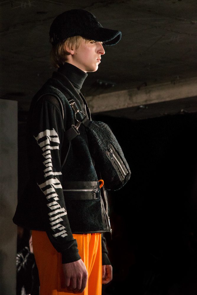
Blood Brother brought a distinctly London perspective to menswear with a collection inspired by the River Thames and the city that has grown around it. Rather than treating London simply as a backdrop, the brand looked closely at its architecture, waterways, working history and urban character, translating those references into a collection that balanced tailoring, sportswear and practical outerwear. The presentation brought together the recognisable Blood Brother attitude with a more considered exploration of the city. Cartographic imagery, embroidery, oversized silhouettes and functional details created a wardrobe that felt contemporary while remaining firmly connected to London.

Mapping the City Through Clothing
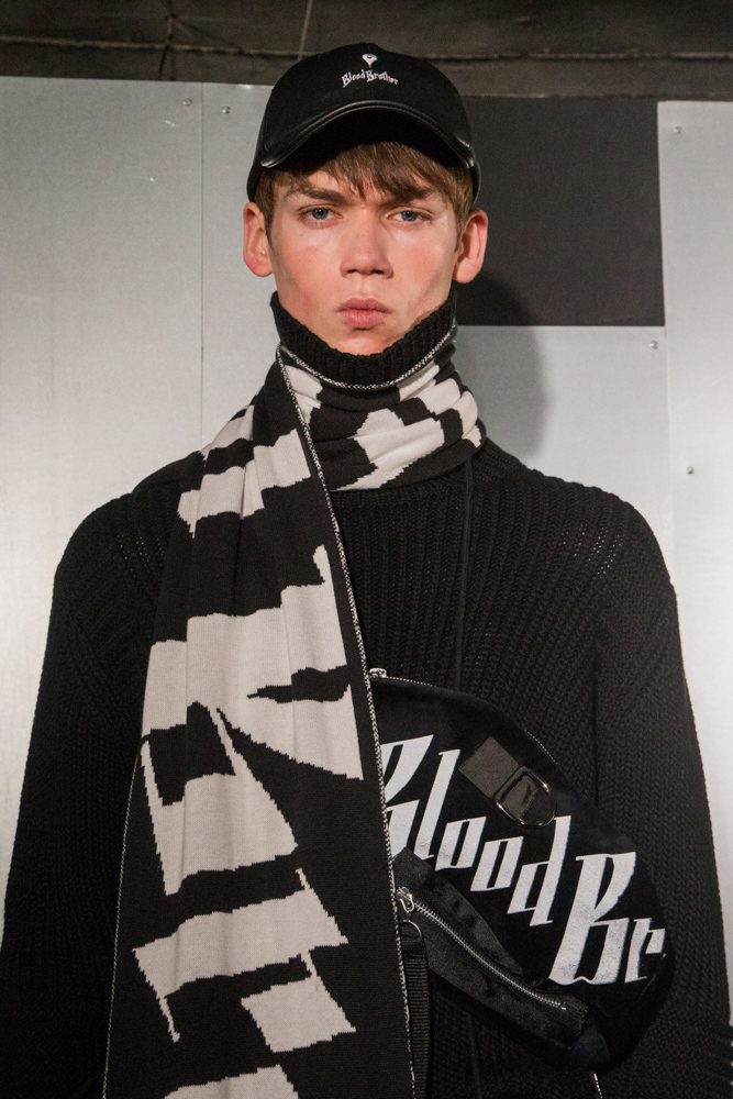
One of the strongest elements of the collection was its use of cartography. Abstract map-like prints referenced the Thames and the constantly changing landscape of London, appearing across garments in a way that made the city itself part of the design. These graphic elements were balanced by more traditional menswear pieces. Tailored garments were given boxier, elongated proportions, while shirts, sweatshirts and outerwear introduced a more relaxed attitude. The result was a collection that moved naturally between smart and casual dressing. Detailed embroidered motifs added another layer of visual interest, particularly against darker fabrics. Metallic and aqua tones brought flashes of colour to black and navy pieces, giving the collection a sense of movement and reflecting the relationship between London’s architecture, water and light.
Utility Meets Urban Style
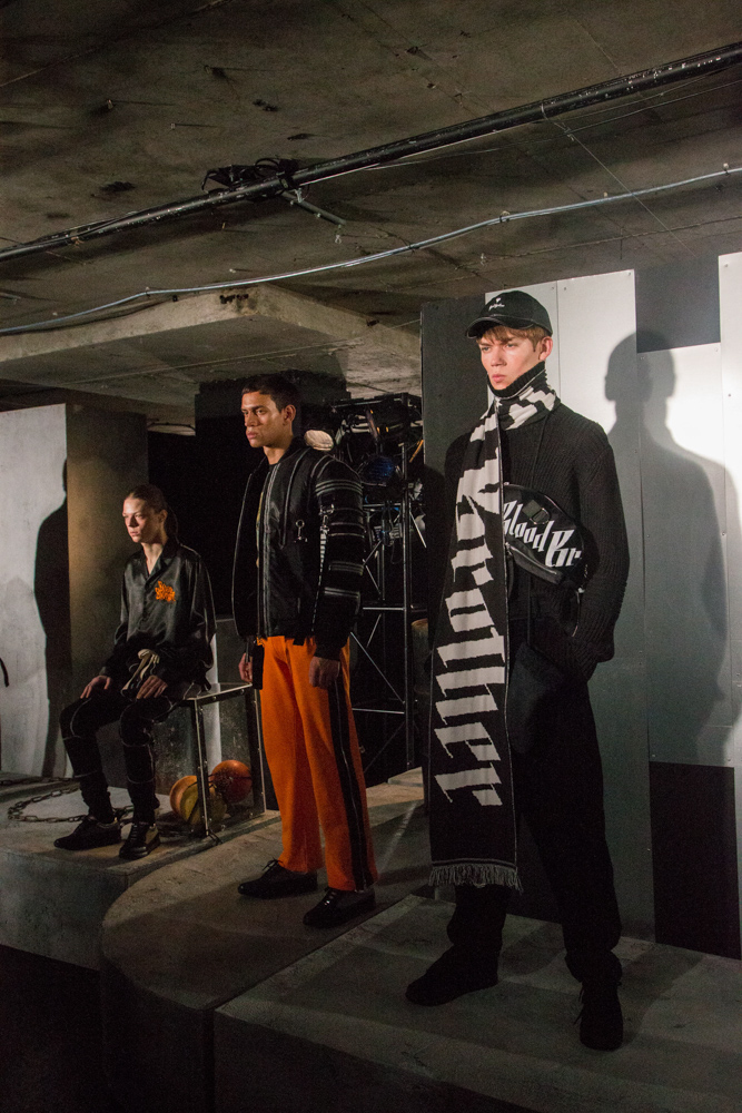
Functionality has always been important to Blood Brother, and this collection embraced that idea through practical outerwear, oversized coats, bomber jackets, technical-looking fabrics and useful pockets. There was a distinctly urban quality to the styling. Loose trousers and relaxed tracksuit shapes sat alongside structured jackets, while layered pieces created silhouettes that felt practical for everyday London life. Some looks leaned towards a modern uniform, combining the comfort of sportswear with the sharper character of tailoring. The collection also played with proportion. Slimmer pieces appeared alongside generous coats and oversized layers, allowing the silhouette to shift from fitted to relaxed rather than following a single shape.

The Colours of London
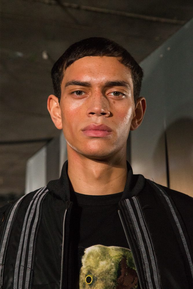
The palette reflected the darker, industrial side of the city, with black, navy, grey and muted tones forming the foundation of the collection. Against this restrained base came sharper flashes of orange, aqua and metallic colour. This contrast helped the graphic elements stand out. Bright details appeared almost like signs or reflections against the darker clothing, while embroidered designs and printed surfaces gave otherwise simple silhouettes a stronger visual identity. It was a very Blood Brother approach to London: practical but expressive, familiar but slightly unexpected.
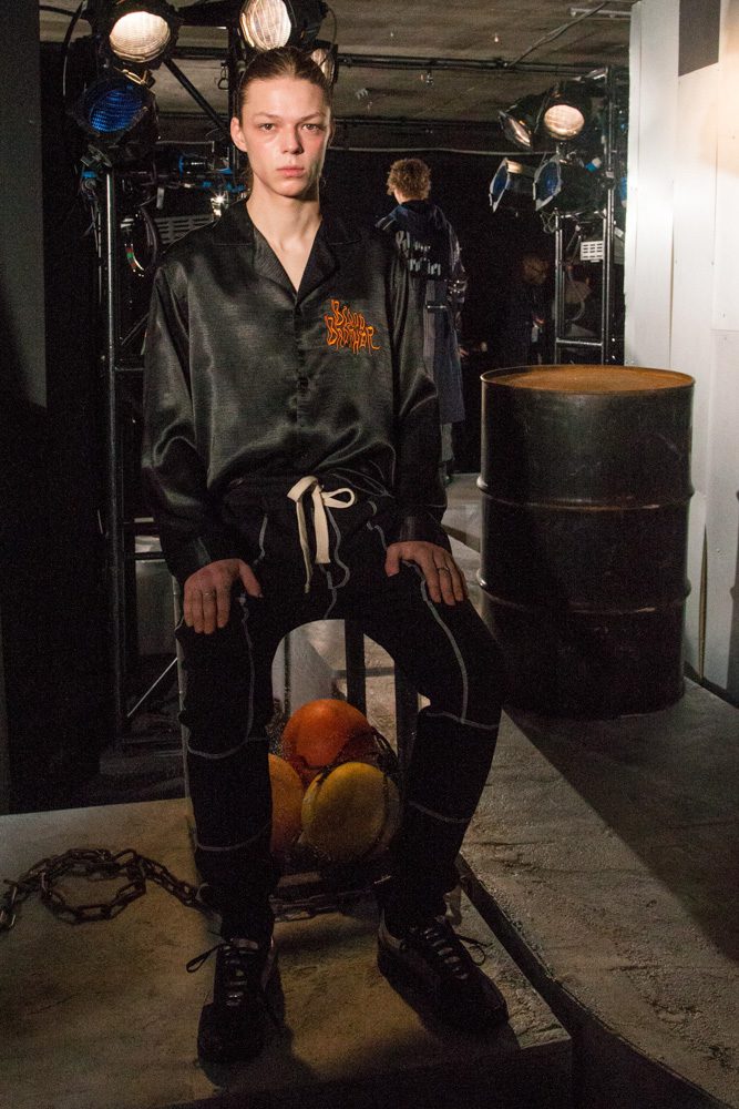
The Modern London Uniform
What made the collection particularly strong was its wearability. The references to the Thames and London’s history were not translated into costume. Instead, they became details within an adaptable modern wardrobe. Oversized coats, bombers, hoodies, tailored jackets, loose trousers and functional accessories could be layered together in different ways, creating a sense of individuality within a common visual language. The collection also marked the return of Blood Brother’s accessories line, with practical bags and other pieces reinforcing the utilitarian character of the clothing.

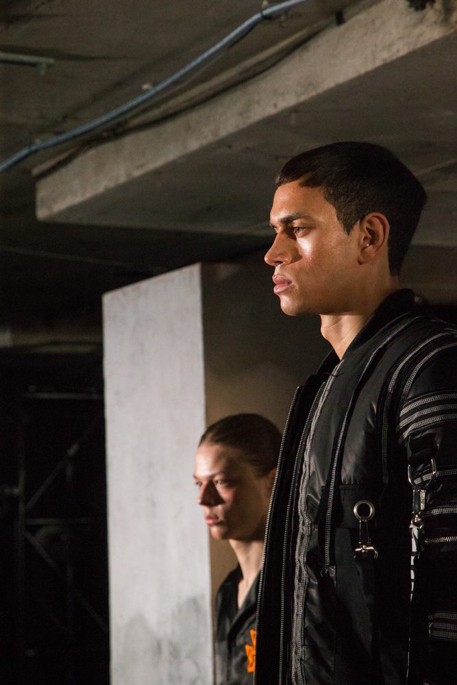
CARRO Studio Behind the Lens
For CARRO Studio, photographing Blood Brother meant capturing more than individual garments. The presentation offered an opportunity to document the relationship between print, texture, proportion and styling, showing how the collection worked as a complete visual story. Close attention to the details reveals the craftsmanship within the pieces; embroidered surfaces, graphic motifs, layered fabrics, pockets, fastenings and the contrast between soft sportswear and more structured tailoring. The photography also captures the personality of the Blood Brother man: confident, urban and contemporary, with a wardrobe that does not have to choose between functionality and fashion. Blood Brother’s collection demonstrated how strongly a sense of place can influence contemporary menswear. The River Thames, London’s architecture and the city’s working history became a starting point for clothing that remained modern, practical and highly wearable. Through oversized outerwear, relaxed tailoring, graphic prints, embroidery and flashes of colour, Blood Brother created its own interpretation of London, a city seen through clothing rather than simply photographed as a setting. CARRO Studio’s images preserve that relationship between the clothes and the atmosphere of the presentation, capturing the details and attitude that make Blood Brother’s approach to London menswear so distinctive.
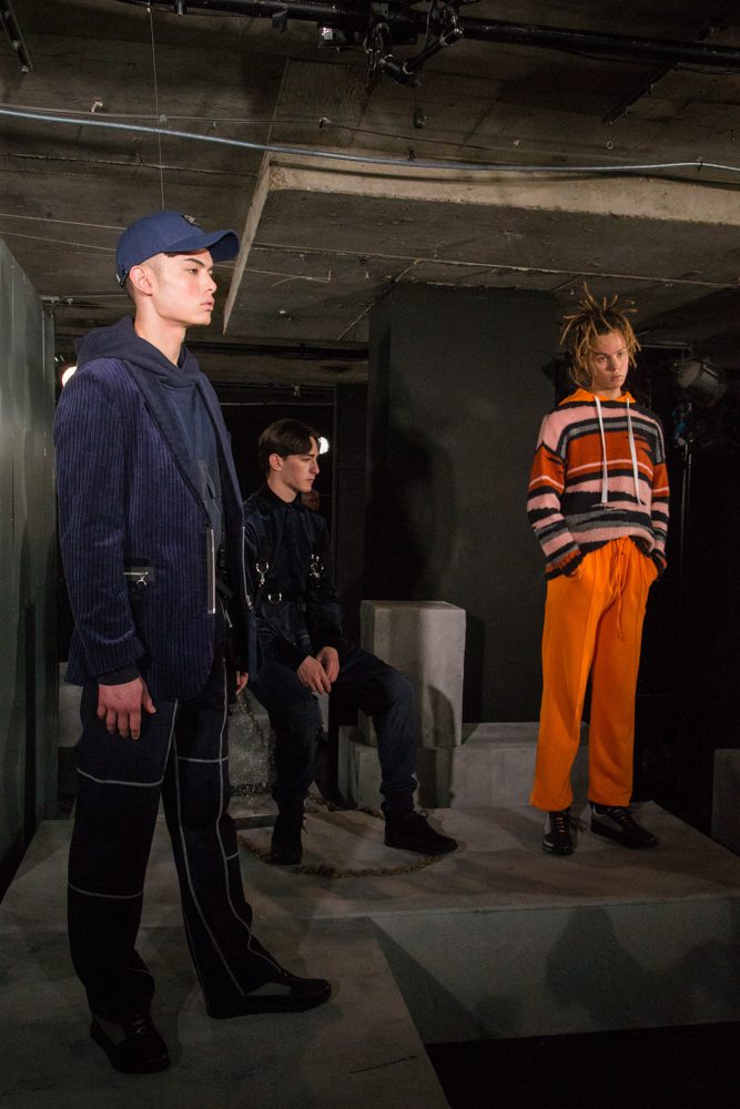
0 Comments